#gradient maps fun and cool
Explore tagged Tumblr posts
Visit Tumblr Blog
Explore Tumblr blogs with no restrictions, modern design and the best experience.
Last Seen Tumblr Blogs


Fun Fact
Kazakhstan’s Minister of Communications and Informatics has blocked the Tumblr site because it contained 60 sites of terrorism, extremism, and pornography in 2015.
Text

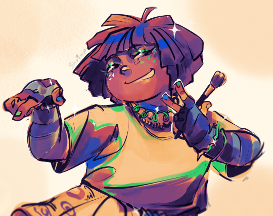
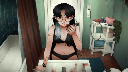
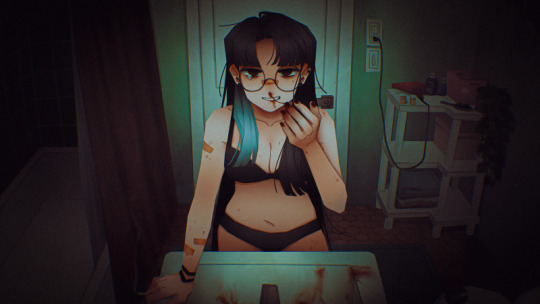
oh i forgot to share this cidilfus sketch from a couple weeks ago!!!!!
#ffxvi#ff16#ffxvi fanart#ff16 fanart#cidolfus telamon#cid telamon#my art#digital#sketch#gradient maps fun and cool#i encourage everyone to try them out if ur sketches seem boring
69 notes
·
View notes
Text
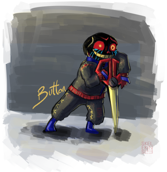
Button belongs to @cranberrytea451
#bittybones#bitty button#this is the first time ive done an error and he was actually super fun#i referenced his fancyman outfit -u-;#no gradient maps this time#idk what color his scissors are but i gave him red n gold#skelekins art#fren bitties#button is so cool ;w;#needa draw gilbert too sometime#he'd probably be better at socializing for peye#idk if errors eyes glow#error bitty
167 notes
·
View notes
Text
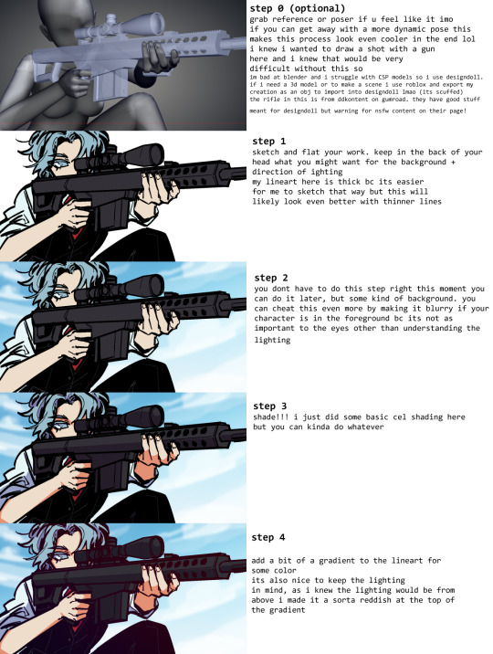
Art style breakdown /tutorial(??)

Some friends asked so here we go : disclaimer im bad at explaining (so feel free to send an ask or smth)
Final art (long read so theres a timelapse at the end)


If its not for something important (commissions), i dont usually make a lineart for a drawing but just clean up the sketch , it wont be used anyway

I usually separate them by colors , mostly so i can Alpha lock them and not worry about coloring over parts
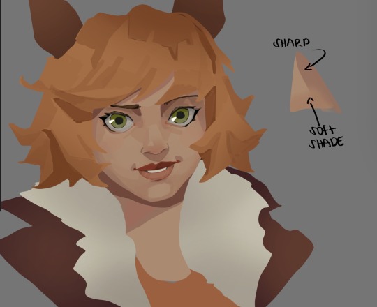
When coloring i use a soft airbrush to have gradients within the shading , so its not one solid color . How i shade is very blocky , lots of triangles lol (if im using CSP i love using the lasso fill tool ) but there are parts especially in the skin where I keep it smooth and blended, usually nose and cheek area . Using an asaro head is usually a good start to learning how to shade faces with planes in mind

Depends on the character, but I like adding shadows on the lashes/brows itself , make it look solid and 3d , it makes the eyes pop more imo

Using multiply layer to make the shadows darker for more contrast
At some point I’d merge everything together so i can just paint in one layer, easier to fix things with liquify too ; if im in CSP i keep the separate layers in one folder just in case i need em later but i cant really do that in Procreate cos of layer limits

This is the part where i make the shading more painterly .,To make the shading look sharper , i like adding lines on the edges .
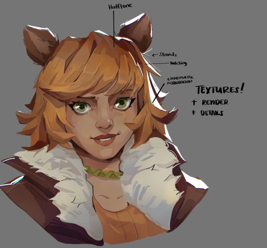
The fun part : adding the ✨
This is the part where I add textures , either from texture images or with screentone/hatching brushes. This is also around the part where i add the character’s accessories and stuff like scars and freckles (its just easier to add smaller things near the end than having them accidentally painted over at the start)
Whenever I feel like the drawing looks too much of a similar shade / temperature , I use a gradient map+layer effects (masked) on parts to give it variety . Technically you can do this by just having a layer effect on and manually adding colors but gradient maps make me go “ooooh didnt think of that color there “
CSP also has a posterization filter that i like using when i feel like some part looks too smooth to me.
I sometimes add in sketchy lines , and seeing how cool it looks in Marvel Rivals art ive been adding it more lol
Artists that influenced me are : Nesskain, Toni Infante , Valorant’s 2d art(their main artist is Suke) ,Arcane , Spiderverse and the most recent one ive been obsessing over is Marvel Rivals ( its got everything i want my art to be when it grows older lmao )
593 notes
·
View notes
Text

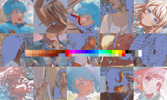
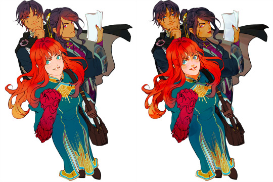
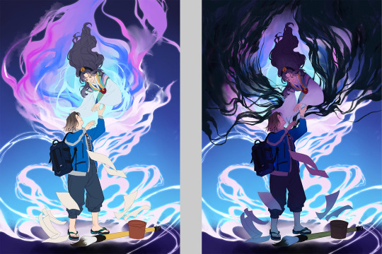
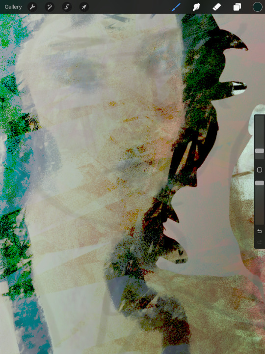
i use a lot of subtle, low-opacity gradient maps when colouring and i've always liked making wacky ones like this which don't have any real use and kind of obfuscate details when used on real art. but they are an absolutely perfect for illustrating me kobolds. this is the actual skin colour
so i decided to go all in on temperature zones & phases being very important to them and i did mention (somewhere?) their physical traits changing based on external temperature and i thought it would be fun to assign each one a gradient (unique to them, can be any series of colours but usually one end is dark and one is light) based on those temperature fluctuations, making each one essentially a big heat map of their body. the colour change takes weeks, it's not quick, but it is always in a state of flux.
it's based on the images captured by heat sensitive cameras. the hottest areas are the face (particularly around the eyes), the chest, armpits, and groin. the 'cold' areas are those which experience the least amount of heat loss (the extremities are 'cold' because the body doesn't waste resources trying to heat them up). in this pic darker = these areas are cool to the touch, and lighter = warm to the touch (so 'cold phase' is full heat conservation mode, and 'hot phase' is actively trying to lose heat so more areas are warmer). the skin colour has no effect on temp gain or loss it's just a side effect. maybe if they ever saw sunlight in their normal lives it might, but in a cave? doesn't matter
the hair & juvenile down is also affected but of course only the roots will change, which means over time if an individual experiences prolonged periods in different temperature zones, their hair can grow in stripy
#i'm honestly kind of excited to finally assign some of my never-used wild gradient maps to some characters#colour in greyscale. map to gradient. overpaint to fix the sclera/tongue/teeth etc (as i did not here)#these lines are from the same pic as the baby i was making a whole chart#but took this one out to fiddle with the colours#dog knight story
241 notes
·
View notes
Text
how to make cool blobby turing patterns in photoshop
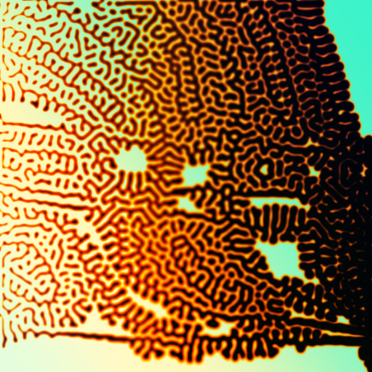
i'll preface with i learned the basic loop from skimming a tutorial on youtube, but as someone who prefers written tutorials i'm sure many would appreciate one! also, the second part of this is some of the visual effects i figured out on my own using blending modes and stuff.
i'm using photoshop CS4 on a mac so some buttons and stuff might be in different places on windows and newer photoshop versions but all the actions are the same. my canvas is 1000x1000 pixels.
UPDATES (i'm hoping these'll show up whenever you open the readmore?)
it's possible to do something similar in krita using this plugin, made by the love @arcaedex
it's also possible to do this in photopea, a free browser alternative to photoshop! the results are pretty much identical.
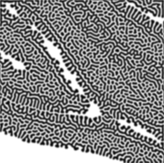
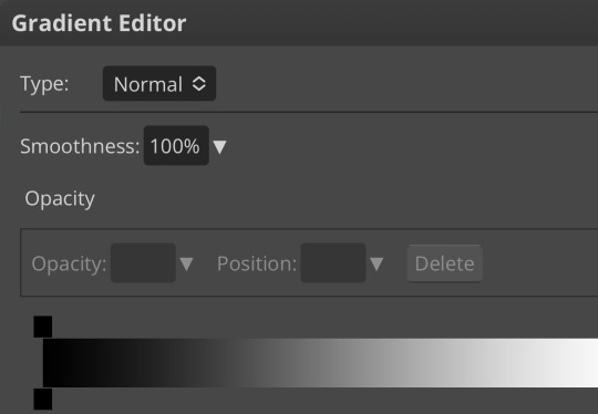
FIRST off you wanna get or make a black and white image of some kind. it has to be one layer. can be noise, a photo, a bunch of lines, whatever. here's mine, just some quick airbrush lines:

now find the actions tab. idk what it looks like in newer versions of photoshop but you probably won't need to dig!
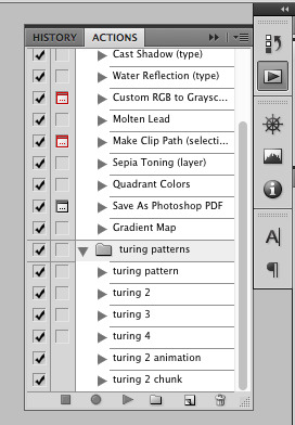
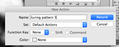
hit the little page thingy to make a new pattern. once you hit 'record', it'll record everything you do. the little square 'stop' icon will end it.
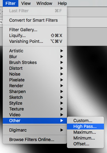
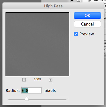
now you want to do a high pass filter. you can mess around with the radius to change the size of your squiggles, but the tutorial had it set to 6. experiment!
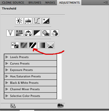
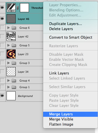
now add the 'threshold' adjustment layer. i use the adjustments tab but i think there's also a dropdown menu somewhere. keep it at the default, 128. merge it down. (control or command + E or you can right click it like some kind of weirdo)
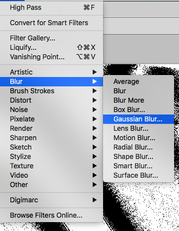
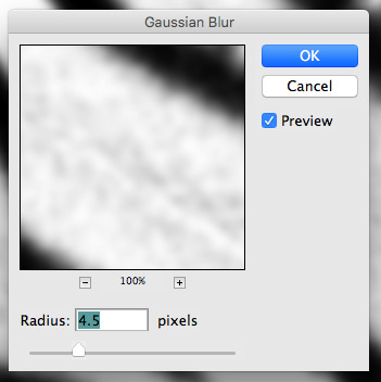
and finally, the gaussian blur! the radius of this affects the shape and size of your squiggles as well. i like to keep it around 4.5 but you can mess around with that too.
after that, hit 'stop' on the action you're recording, and then repeat it a bunch of times using the 'play' button, until you have something you like, like this:
WOW!! that was fun!! and only a little tedious thanks to the power of macros. anyway, here's some fun layer blending stuff i like to do. it's with a different pattern cause i made this bit first.
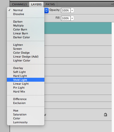
anyway, using a black and white gradient (or a grey base that you do black and white airbrush on), make a layer with the vivid light. this will make the blobs look thicker or thinner.
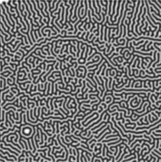


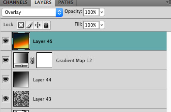
then, for cool colors, do a gradient map adjustment layer over that:

and finally, my best friend, the overlay layer. just using a gradient here bc i'm lazy, but feel free to experiment with brushes, colors, and blending modes!

NOW GO. MAKE COOL SHIT WITH THE POWER OF MATH. AND SEND IT TO ME
also these are not hard and fast rules PLEASE mess around with them to see what kind of weird shit you can make. here's a gif. as you can see i added some random airblush blobs in the middle of it, for fun.
933 notes
·
View notes
Note
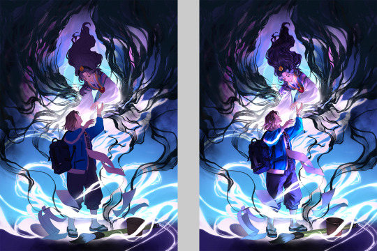
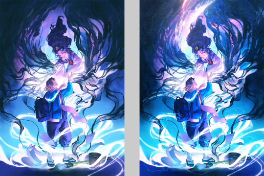
Omg your most recent art… your lines have such great motion and confidence 😍 does that pen change color based on pressure?? The blue into darker/black is so cool looking
thank you so much! i've actually been feeling a little burnt out/artblocked lately, and those pages were something i was doing fo try to loosen up and have fun again, so i'm so happy to hear it's noticeably working lol!!
re: the colors, i have a gradient map atop all the other layers at about half opacity, which gives ALL value gradations on the page that kind of color-shift effect; but the pen i used is just a normal one with some pen pressure opacity/line width effects! it's one of my favorite little tricks and something i do on just about all my digital art recently
#im in bed now but tomorrow if i remember i'll take a cap of fhe actual color gradient im using#and maybe a comparison of how the sketchpages look without the gradient map
113 notes
·
View notes
Note
I NEED TO SEE MORE SWAP JASMINE !!!
Oh she is such a cutie-pie!
a bit of rant under da cut!
She wanted to become friends with Haze in first grade, but girl tried to seem "cool & mysterious" and also the attitude "Im the most mature out of yall" didnt really helped that. Plus, Hazel is a fan of scary stuff, flies on the drones above everyone`s heads and has a resting mad face, so their contact was kinda limited. Later tho, after Devs arrival into the city(due to his dads business biggering), Hazel managed to become friends with her eventually. For a short period of time, but still that`s kinda counts!

She probly sad that she won`t have the opportunity to hang with Haze more, and see her room, at least yet. But she is determined to become friends again after the "memory-erase". She kinda thought Haze AT LEAST hated her, but they have many small things in common!
Does Jasmine trying to incorporate some tunes in her music that she heard from the Fairy World or Cosma family after the 1s finale? YES.
Winkle now is her make-up test subject now btw

she is fun to draw, even if i don`t do Jass much, i love doing gradient-map stuff on her, it kinda fits her character???(not sure how it makes sence for anyone but me ...yea)
#slow but determined to answer the asks as soon as possible! ...the week is hella hard on meeeeee-#swap au#the fairly oddparents#fairly oddparents#fairly oddparents a new wish#fairly odd parents#fop fanart#fop art#fop a new wish#fopanw#fop anw#digital drawing#fop#a new wish#jasmine tran#the fairy oddparents a new wish#fop jasmine tran#fop jasmine#hazel wells fanart#hazel antoinette wells#fop hazel wells#fop hazel#my art#hazel wells
115 notes
·
View notes
Note
hii just wanna say that ur art is so so pretty and so so cute... ^_^ i absolutely love the way u shade and color its so mesmerizing to me
while we're on the topic how do you pick out your colors? especially when theres complicated lighting or effects (affects? idk) if that makes sense.. i love coloring and shading my art but it always finds a way to kick my ass lmaoo
anyways ur work is so awesome and definitely a huge inspiration to me ^_^ have a good day/night whenever ur reading this
THANK YOUUUU!!! you know what. I will not gatekeep any longer and reveal my secrets............... The Secret Is!!!!!!!!!!! um,
its just gradient maps and photoshop camera raw tbh... OBV LIKE. i know color theory a little but more i honestly really rely on post processing more than anything. while im an artist and i love doing art im.... i'm just really good at bullshitting LMAO i'm better at little tricks to get to the finished product than like. being actually knowledgeable and practicing things..... which i should do more. I need to do more studies when i have time.... there's no harm in shortcuts or references or tricks and i've learned to not be ashamed of it!! (obviously, this is not referring to generative image AI or directly tracing/stealing from other creators i need to be clear) end product- creating cool visuals/scenes is what is my passion for art has really come to in the past few years and while it's made me, sadly, a very ambitious perfectionist (the worst combo), it's the most fun i have with art!
anyway. i actually made a bullshitting tutorial for some friends who wanted to know my process for my more quicker art pieces last year and so i will now present it to the public. Behold!!! the fucking thing!!!!

i pulled open some other, more complete pieces so you can see the change from Raw Colors ↓ First Pass Post-Processing (CSP layer effects mainly and adding gradients/vignettes where needed for depth) ↓ Second Pass Post-Processing (Photoshop Camera Raw + back to CSP for finalizations like noise/chromatic aberration) here's the shrimpku print


and for something a little crazy heres the salt wound routine art evolution LOL (this may not be exact, the layers are weird and i did many passes before figuring out what i wanted)


i wish i had more like...... genuine advice or something more substantial to recommend HAHA but i hope this helps in some way at least!!!
62 notes
·
View notes
Text
…make a psd look interesting?
aka, how to fuck up a psd no glue no borax. have you ever looked at your psd and gone, damn, this shit doesn’t fuck? happens to the best of us. here are easy ways to spice up your psds so you don’t end up with the editor equivalent of communion bread
for example purposes, i made a simplistic psd to test these methods on. they should work with most psds, but, as always, fuck around and find out on your own for best results <3
i. threshold + gradient map
this one is an easy way to add specific colors to your psds. step one: add a threshold layer, and adjust it your liking. typically, i set mine to somewhere between 60-40. if you’re making a psd to work on dark skintones, you may want to set it even lower, but if you’re working with, say, pjsk characters, you can go pretty high
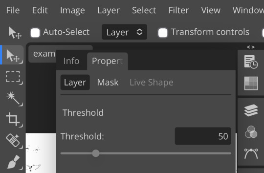
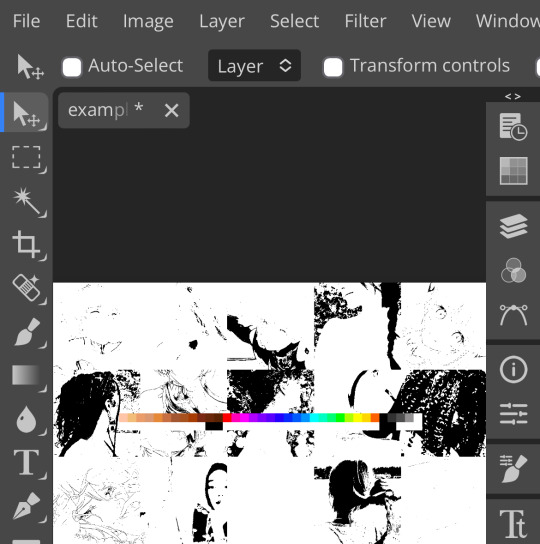
wow flashbang. you can see on my example behind that it doesn’t work super well on irl pictures, and my pjsk images don’t have threshold at all lol. next thing you want to do is set the blending mode of your threshold layer to either multiply or darken—they’re basically the same thing
(psst, if you want to know more about blending modes, check out this post!)
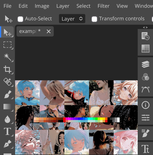
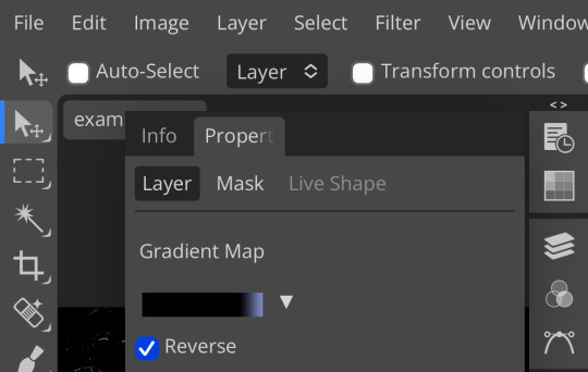
waow crunchy! but still boring right? still boring. not to worry, here’s the fun part: add a gradient map layer, tap it, and go to the slidey icon on the side, which’ll bring up a page like this:
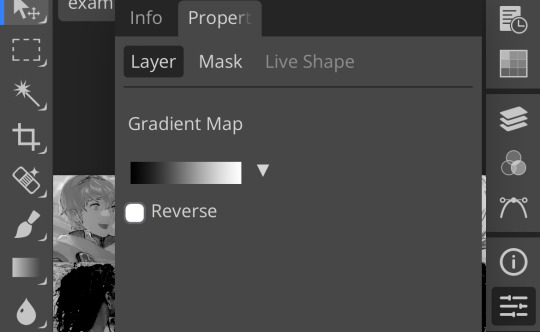
click the gradient in the middle there to edit it. once in, edit the black color to be at about 80-90%, and then change the white color to whatever you like. edit out, and tap the little square next to the text that says “reverse” which should make your gradient look more or less like this:
then change the blending mode on your gradient map to ‘screen’ which’ll axe all the black and just leave your color. now your image looks like this:
boy howdy, isn’t that fucked up! it is more interesting, but if you don’t want to be looking at that abomination, change your color in your gradient map to be darker, which’ll give you something more along the lines of:

…which is much more reasonable. this is a fun way to add color to your shadows slash lineart, and can be a quick and easy way to make a psd look less flat.
ii. noise gradient map
some of you may be thinking, but, canarysage, what the fuck is a noise gradient map? to which i reply: you’re boring. let me show you.
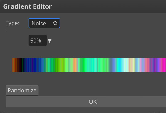
kinda fucked up, right? well, that’s the goal. unfortunately, there isn’t a way to directly edit a gradient map, but you can just click that little button that says ‘randomize’ a couple times until you get something you like! you can also mess with the percentages but i don’t do that because it looks weird

boy howdy, that’s weird looking. not to worry, though. once again, our best friend blending mode is going to come in handy
i typically go to soft light and set the opacity to about 20-30%, but, as with anything, feel free to mess around and do whatever you want. luminosity is also a fun setting for noise gradient maps, just make sure to crank the opacity way down for the sake of my eyes

wow, much better! you can see that the gradient map added a bit of purple coloring and a funky little texture. super cool! thank you, gradient map!
iii. channel mixer
i already have a post on channel mixer and i’m not rewriting all that so if you don’t know how channel mixer works check that shit out but the tl;dr is: ideally, all your channels should add up to 100 (including negative numbers) but that rule can be broken if it looks cool enough. capiche?
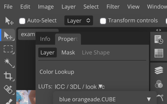
iv. color lookup
photopea has a few default color lookups that are pretty easy to use, but i have a couple of presets that i like to add if i’m feeling stuck. to make your own color lookup, open up a psd, and go to file > export color lookup
then save it and open it from your files. when you open a color lookup layer, you’ll see an arrow next to the text saying LUTs—click that and your new color lookup should be there
once you tap that, you’ll get a compressed version of your psd added to your folder. it’ll look something like this:
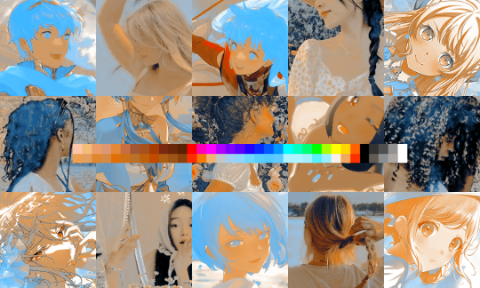
holy orange and blue, batman. luckily, you can apply blending modes to color lookups just like any other layer—mess around with them until it looks how you want!
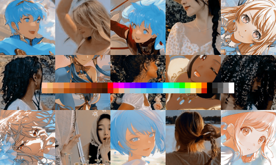
waow much more reasonable! i set this one on color and about 55% opacity, but that is really dependent on what your color lookup looks like and how you want your psd to look. remember, there’s no right way to do things!
an additional note: if you want to, you can save the psd you’re working on as a color lookup instead. if it looks too simple or just isn’t turning out how you want, that’s a good way to incorporate it later :3 just follow the same steps as above!
v. no shame in starting over
if you’ve added and taken away, duplicated and removed, fucked around and found out, and your psd still isn’t how you want: it’s alright to just axe it. the edit police aren’t gonna kill you for it, i promise. if you’re worried about wanting it later, just save it as a psd and come back when your brain is refreshed ¯\_(ツ)_/¯
psd-making isn’t an exact art, so, obviously, there’s no real simple solution to making it look how you want. you just have to mess with it and see what you’ve got. these are just my methods of making my psds less blagh, but, obviously, my editing is moderately more deranged than your average editor.
…so that’s how you do it.
127 notes
·
View notes
Note
Hello Botanica I admire your art so much ❤️ do you mind giving tips on how you improved your art over the years? I would also be delighted if you could show us what your drawing process is like a little bit, if not thats cool too🤗 have a great day!!✨
Hey there! (*waves*) Thank you so much for the love <3 I'd be happy to share some insights on the topics you mentioned! (Sorry that it took a while.)
I think I’ve been drawing for almost 20 years now (Whoa!). Honestly, I don’t even know how I made it through, but ever since I was a kid, I knew art was a necessary part of my life. Looking back now, I’m just glad I stuck with it!
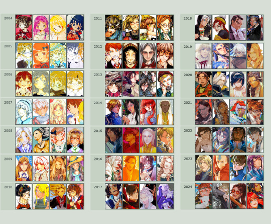
This piece is like a visual timeline of my art evolution. It’s wild to think I went from those super basic kid doodles to the style I have now. Growth is real, y’all!
So the tips! (They are mainly for those hobbyist artists, since I don’t have the luck to make it as my career.)
Keep your eyes and mind open to learn from different fields. It’ll spark fresh ideas and enrich your art, but always double-check when diving into unfamiliar territory.
Find tutorials that vibe with you, and collect references IRL.
Use primary sources to avoid distorted or AI-altered refs.
Take your own photos as ref.
Use 3D websites like Sketchfab, Blender for 3D assistance, and posing apps or manikins to help with your art.
Practice consistently. Balance your time between quick sketches and more polished pieces.
Accept where you are now and improve from there. Don't let others' opinions or other artists’ activities throw you off your path.
If art’s your hobby, the goal is to have fun! No pressure to push boundaries unless you’re feeling it.
Let’s move to drawing process. I’ve been doing hand-drawn art for more than a decade, but had to fully switch to digital media after 2016. Now I usually use Procreate for sketches and lines, then use Clip Studio Paint and Photoshop for colors and adjustments.
I’m gonna share two sets of process. One is for generic character art, and the other one is for pieces influenced by environment.
So character art is like:
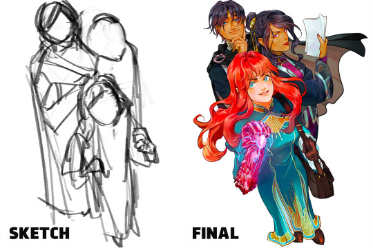
(More under the break.)
Do some (very) rough sketch to locate the characters → Line art
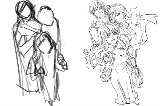
Define coloring section → Do flat basic colors, adjust the tone via gradient map, change line color
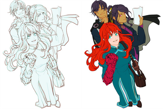
Add more details, use airbrush to shape the volume → Rendering (layer mode: multiply, linear burn)
More rendering (layer mode: screen, overlay, soft light) → Post effects
Done!
The next is art influenced by environment:
Make a color sketch to set the general tone → Line art
Flat basic colors (background & characters) → Darken the art (layer mode: multiply), add more details
Add more details and begin rendering → More rendering, lighten some parts (layer mode: screen)
More rendering, use gradient map to adjust the tone → Post effects
Done!
Wow, this turned into a long post! Hope you found something useful here! Thanks for sticking around till the end! 🙌✨
41 notes
·
View notes
Text

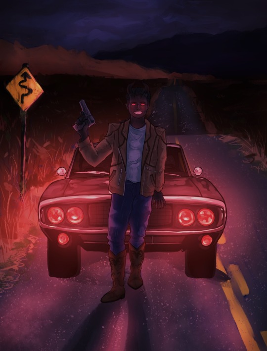

Hello HELLO fine interwebs folk I'm gracing your Demon Road feed with MORE Milo Sebastian fanart
I want you all to know that the background was painful, the car was painful and yes maybe the lighting was also painful but you know it's the fun we had along the way... or something...
The other 2 versions I slapped a gradient map on cos it looks *cool* and I'm nothing if not super duper cool (I swear to you)
#demon road#demon road fanart#milo sebastian#art#digital art#skulduggery pleasant#fanart#artists on tumblr#digital illustration#demon#dodge charger
25 notes
·
View notes
Text

A little bit ago I just sat down and was like "yeah" so here's this lol
I wanted to gave fun with my art the way I did when I was doodling in school. So I just kinda went for it.
AND THEN the power of gradient maps made this look really cool with the brush choice I used. So that's rad.
Uh yeah : )
Also THATS RIGHT two whole posts in one week?? um yeah i have a backlog building up so i'm trying to post one request and one original thing a week until i run out of requests lol. i want to post some of my personal stuff. like i made this doodlepage in early august ;;
i genuinely am super thankful for all the requests though i'm having so much fun with them so i don't mean to sound ungrateful lol
63 notes
·
View notes
Note
hello!! this isn't a request but rather a question - do you have any tips on making layouts like you do (not in the literal sense, but when it comes to making layouts in general ,,)? i usually struggle to make the coloring look good/fit the theme, and i can't seem to find any good pngs to use ,,,
you're not obligated to answer this, by the way!! and thank you in advance!!
Generally, I'd say to collect a bunch of resources you can use, like PNGs, laces, colouring PSDs, etc. You can find a bunch by browsing related tags here on Tumblr ( ie. [aesthetic] png, rentry png, [colour] png, etc. ) or on Pinterest by searching similar things and things like [aesthetic] frame, [colour] frame, rentry frame, rentry resources, etc etc. You can also look on sites that have a bunch of free use PNGs, vectors, etc ( though I'd highly recommend having an ADblocker and popup blocker ). I have a large collection of random things I use and it helps a lot!
I don't have many tips for making layouts since I honestly just mess around a lot until I get something I like, so I'd say just play around with placement and combining things until you get something you think looks nice! Trust the process and just have fun with it, if something doesn't work out, that's fine too! The important part is just having fun with what you're doing, it's a hobby, not a job you're forced to do.
As far as colouring goes, it's just something you learn as you go, I think. I'm still not terribly good at making colouring PSDs and I've been editing for over a year now. You can always search DeviantArt or Tumblr for colouring PSDs by searching things like 'free psd' or something.
Some sites you may find helpful: da-lace : has TONS of laces, you can navigate via the shapes at the top or by category on mobile I believe. vecteezy : tons of free to use downloadable PNGs, vectors, etc. pngtree : ^ same as above, I'd recommend an adblocker / popup blocker. gif editor : does cool gif effects remove gif bgs : what it says. gif effects : can do fun stuff with it but it adds a background.
More specific sites: barrachiverio : custom error message PNGs. gradient maps : what it says.
I hope this helps you out a bit, happy editing!
82 notes
·
View notes
Note
can you do a breakdown on how you color? i find interesting how you mix many textures and colors in a piece
Ofc! Color is my favorite thing about drawing. :D
I made like a very brief rundown with the technique I use for a majority of my drawings but ofc it still varies a little.
Usually the only cases my process diverges is in the rendering. The color jitter (can be applied to most brushes in most Programms though the water color 6 brush is like my special angel child) makes a rlly big difference during the rendering due to there already being a lot of texture and Color variation and is something I always do.

After step 4 I usually only stick to either the textured ink for a lot of control, to the velvet for a lot of texture and depth or the classic soft for a more soft gradual end product where the color jitter only shines through.

With the first and third the key word really is color picking.


An example for the third brush. I here I made the overlay extremely faint and used the underpainting peeking through as a way to separate the parts of the coat rather than the lineart (at least from the first to the second picture). Using hue as contrast without making a clear dark-light contrast can be a bit difficult if it‘s done solitarily in a painting but due to color having different depth-perceptions (cool colors seem further away, appear darker even if they have the same value) it is fun to play with esp in combination!
Using the velvet brush is my favorite atm. You can use really vibrant colors and apply them similarly to how you would with ballpoint pens or coloured pencils. It‘s really easy to draw subtle changes in hue without having to be too particular about having the right color and building up the colors leaves you with both a direction that signals to the form of the subject and a rich multitude of different colors that appear completely different than a flat color can.
For this I recommend starting either darker or lighter in order to build up the color in one direction of the other!
Another tip is also to use blur to reduce the sheer amount of color variation of the color jitter if you‘re going to redefine most of the shapes anyways.
Here‘s a speedpaint where I use most of the things I‘m talking about. Flash warning for the sheer amount of color adjustment making the screen flicker at the beginning.
I also didn‘t mention gradient maps yet. Very useful for further color adjustment and in order to bring a very busy composition together color-wise!
Color still is a very individual thing I feel like. There isn‘t one way to color and the way my process is right now is very much fit to my understanding of it. I feel like the decisions you make when rendering; experimenting with colors you thought wouldn‘t go together, breaking the rules you have, figuring out how relative colors are simply because they cannot be isolated. It‘s trial and error but also learning practical lessons that make color make sense to you as you go along.
I hope this makes sense! Color is so fun and I‘m always excited when I get an ask about it. :‘D
Also the jittery water color 6 and Textured Ink brush is free I believe. The bottom two are from a paid brushpack from a creator on instagram. I‘d say only the water Color 6 brush really is something that I find uncommon. The other three can be easily swapped for any other brush that has similar properties. (Pressure sensitivity + texture for the first two and flat marker + texture for the last). I‘ll repost this with a link if anyone‘s interested!
#art#art process#coloring#color theory#artwork#starling‘s art#Ask#flash warning#for the speedpaint#Just to be safe!
48 notes
·
View notes
Note
Not ship chart related but I think your art is so pretty!! Do you have any tips? Especially with coloring if it’s okay <] (/nf)
waah thank you very much! i'll try and explain but here’s my colouring-specific tips, or at least how i choose my colours !! <3
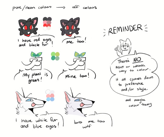
unless for stylistic reasons (e.g. greyscale drawing), i personally avoid pure black, greys and white for colouring. go and choose off-colours instead! for lineart, black is okay but i always go for an actual colour anyways heheh. for the background colour of your canvas, sometimes an actual colour (rather than white or grey) may help you pick your palette to be more harmonised!
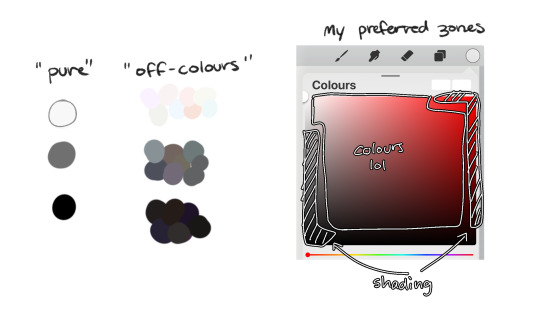
following this, i also don't like using pure/neon for colours (aka the top right corner), unless it's for a certain aesthetic or artstyle (e.g. the character has a "toxic/radioactive" aesthetic; the character is a scenedog (or similiar); or highlights). see below for examples! they may be subtle but sometimes the subtly can make the difference you are looking for, especially if you're looking for a natural look. if you're aiming for the bright/old 2000's artstyle, then pure/neons may be your friend!
when i'm casually drawing characters (oc or not), i rarely colour-pick from the reference image. i find that when you're "forced to make the palette", it can come out more pleasing to your style/atmosphere of the drawing! it’s more personalised that way... like yea, that’s my favourite versions of those colours! i'm not saying that my colours are better though, only that "hey that's me! in those colours!!" you can have the reference image on the side or go by memory. here’s me doing this with pride flags:
nowadays, when drawing the spooky month characters—who have simple designs god bless—i can just imagine their reference and adjust the colours in my head lol example: if i know that Lila's colour palette is purple, and that her winter sweater is coloured lighter than her hair, then i can just go ahead and pick whatever shade i want following that rule!
(of course, always double check with the actual reference for physical design inaccuracies and skin tone if it applies. my advice above is just for general hair/clothing colours! …because yknow you don't want to accidentally whitewash a character's skin in the name of aesthetics lol. if you’re unsure and want to be on the careful side, please do colour pick the skin at least !!)
moving on... gradient maps and certain blending modes (like exclusion, luminosity and darken) can be a game changer too. for normal drawings (e.g. drawings with no environment), i use darken the most because it changes a few colours rather than the entire piece... (the percentages are opacity levels!)

oh and as a really basic shading tip without using blending modes: sometimes, you just gotta go for grey. shading a warmer colour? use grey to make a cool tone. shading a cool colour? use grey to make a warm tone. not all the time (because you don’t wanna make your shading seem muddy), just sometimes…
and that's that! there's always exceptions to rules and often times, your headshot doodle ends up as one big experimental mess (in a fun way, hopefully)!
this is how i choose my colours though most of the time, it is just me going “good enough”
i think we're pretty similar on how we like warm colours! i enjoy going the simple/lazy route and avoid blend modes but then again, shading is a whole different thing…
hope this helps in any way !! <:3 !!! <3
#if anyone wants to ask for specific tips i’m happy to share!#if i have any lol#[ the askbox mourns ]#[ the art of mourning ]#[ mourn's mourns ]#anyways yea i kinda do just imagine the spooky month characters with a light orange multiply layer and then try to replicate it irl#my personal/lazy rule is that if it looks good faraway its good enough AHAHA#spooky month lila#spooky month jaune#spooky month rick#spooky month aaron#spooky month#“actuallyyy the 'black cat' is actually dark grey—” SHHHHHH SHUT SHUT IT. SHUTUT !!!!! i need u to see the lineart /silly#[ mourn's resources ]
98 notes
·
View notes
Note
Im not sure if youve answered this before but what drawing platform n brush do you use? The one you have looks rlly cool with the colour hues n everythin :D
i exclusively use clip studio paint. i have a few brushes i like to switch between but the one below is the one i've been using most often bc the transparency/opacity works well with the rest of my process. if you don't like brushes/pens like this you can also use a border effect to blur out the line a little bit.

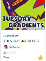
as for the colour, i used to use a noise pencil to draw but now i add a gradient map overlay on my sketches in addition to a couple noise overlays. see:

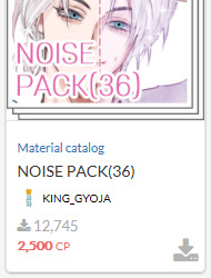
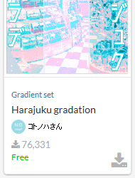
i think i got the second one when it was temporarily free cus i don't remember using that many clippy points,,,, but any noise overlay is good for that crunchy look. gradient maps are great in general, but the best ones are the ones that have funky colours and wide ranges.
if you have any more questions lemme know 👍
update with another fun gradient map set i like and the colouring brush i forgot to add which is this:

75 notes
·
View notes